FILED UNDER:
December 14, 2021
What better way to kick off my design project case study series than with the gal who inspired it? Between the Lines Copywriting is the website copywriter, content & marketing strategist, and business genius that I just so happened to meet accidentally on TikTok in November 2020. After a year of countless voice memos, Instagram DMs, Facetimes, and memes, we decided to add “custom copywriter website project” to our fully bloomed friendship.
The Project
First, a little context. Sara is a personality-driven and SEO copywriter who offers website copy, brand messaging, business consulting and VIP Days (where you can hire her to do sales pages, email marketing, and more). On top of all that, she also has a copywriting course for business owners, mentorship for new copywriters, and a whooooooole lotta resources.
(Ahem—if you’re looking for a way to diversify your business’s income, just poke around Sara’s site. She is the queen of creating offers at different price points, including free—her blog is a wealth of knowledge and I’m obsessed.)
BTL Copy is also a book-themed concept brand, meaning books and libraries are part of her whole vibe in one way or another. All in all, the amount of content meant I had my work cut out for me.
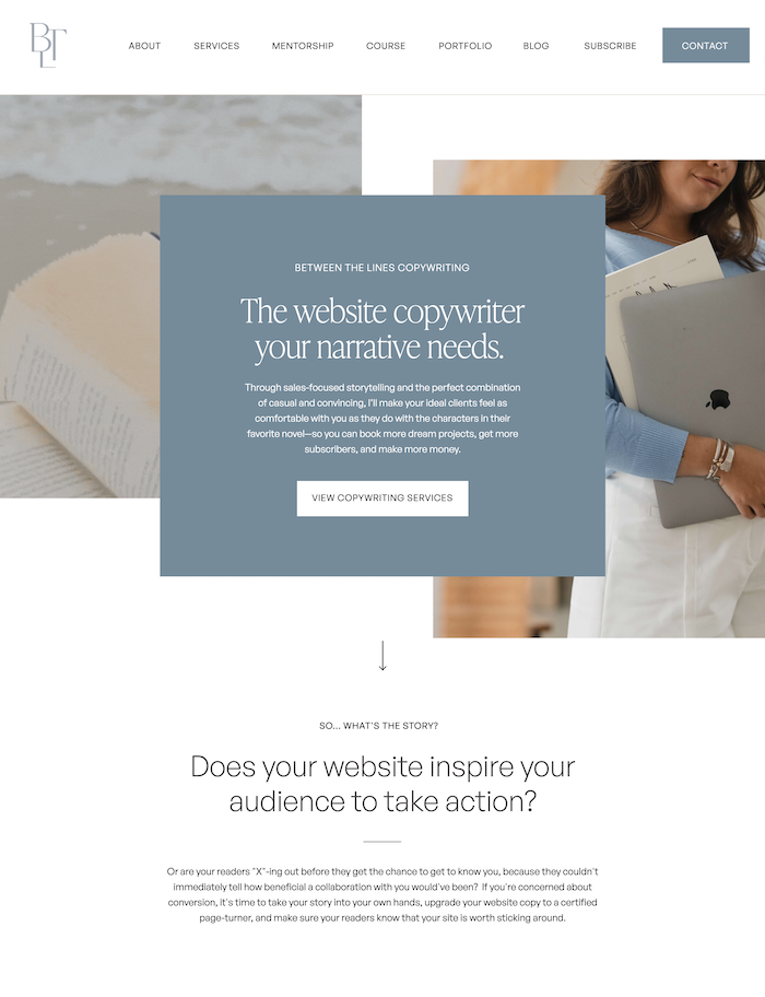
Goals & Deliverables
The main goal of every website I work on is to convert. In Sara’s case, our #1 focus was on selling her services (her most popular and highest ticket offers). But of course, we wanted the passive sales too!
Among our list of goals included:
- Highlight the overall brand messaging of Between the Lines Copywriting: one part strategy, two parts personality
- Capture the already-established book concept brand vibe with pre-existing color palette
- Allow Sara’s fiery personality to shine through the greens, blues, and whites she loves
- Sell services, products, and her course
- Provide education and resources to her audience
- Diversify her income with affiliate marketing
- Establish even more trust and brand authority
In order to meet these goals, we planned for a decently-sized website build. (And it absolutely was. All in all, we created more than 50 custom pages for her. (Yeah, I know– what the hell!?!? Don’t worry, most people’s websites aren’t that huge.)
Design Challenges
Apart from the size of the build itself (and our lofty list of goals), Sara will be the first to tell you that she’s far from a “long story short” kinda gal. While most projects I work on struggle to find enough words to talk about themselves or their services, Sara is in no short supply. So, I knew that my design had to 1.) make the words the star of the show and 2.) visually allow for enough text without overwhelming our users.
Another challenge was finding something fresh & new within her brand consistency. The beautiful part about working with already-established business owners is that sometimes, they already have a brand vibe they are known for. This was absolutely the case with Sara—just scroll back on her instagram page and you can see that her cool-toned, pastel color palette has always been a thing. It was my job to find something fresh and new within it, so that our website launch could have its desired “wow”!
Design Solutions
With a hefty list of goals, deliverables, and challenges, I had my work cut out for me. Here are a few of the design solutions I executed to create the new-and-improved BTL Copy website.
Use of Video and Other Moving Elements
In order to make the brand feel fresh & new again (without feeling unfamiliar), I decided to add movement wherever I could. Whether it was background videos, auto-rotating galleries, or flashing testimonials, I knew the site needed a little zing. Video is also one of my favorite elements to use on a website. With the rise of TikTok, Reels, and other video platforms, there’s really no better way to bing a website into 2022. (If you’ve been thinking about hiring a videographer for your next brand shoot, DO IT.)
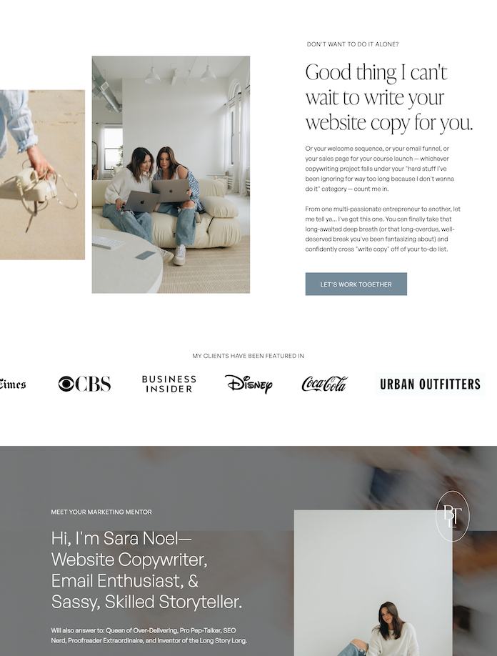
Use of Lines & Structured Sections
In an overall nod to books, I wanted to add a few design elements that made you feel like you were reading (and turning) an actual page. On each page, you’ll find at least once section where I employed the use of lines to give the “book margin” treatment.
On top of the brand concept, lines give us the underlying feeling of structure and strategy that Sara employs in her copywriting projects. They balance out her personality-driven copy in a way that makes us trust and value her expertise.
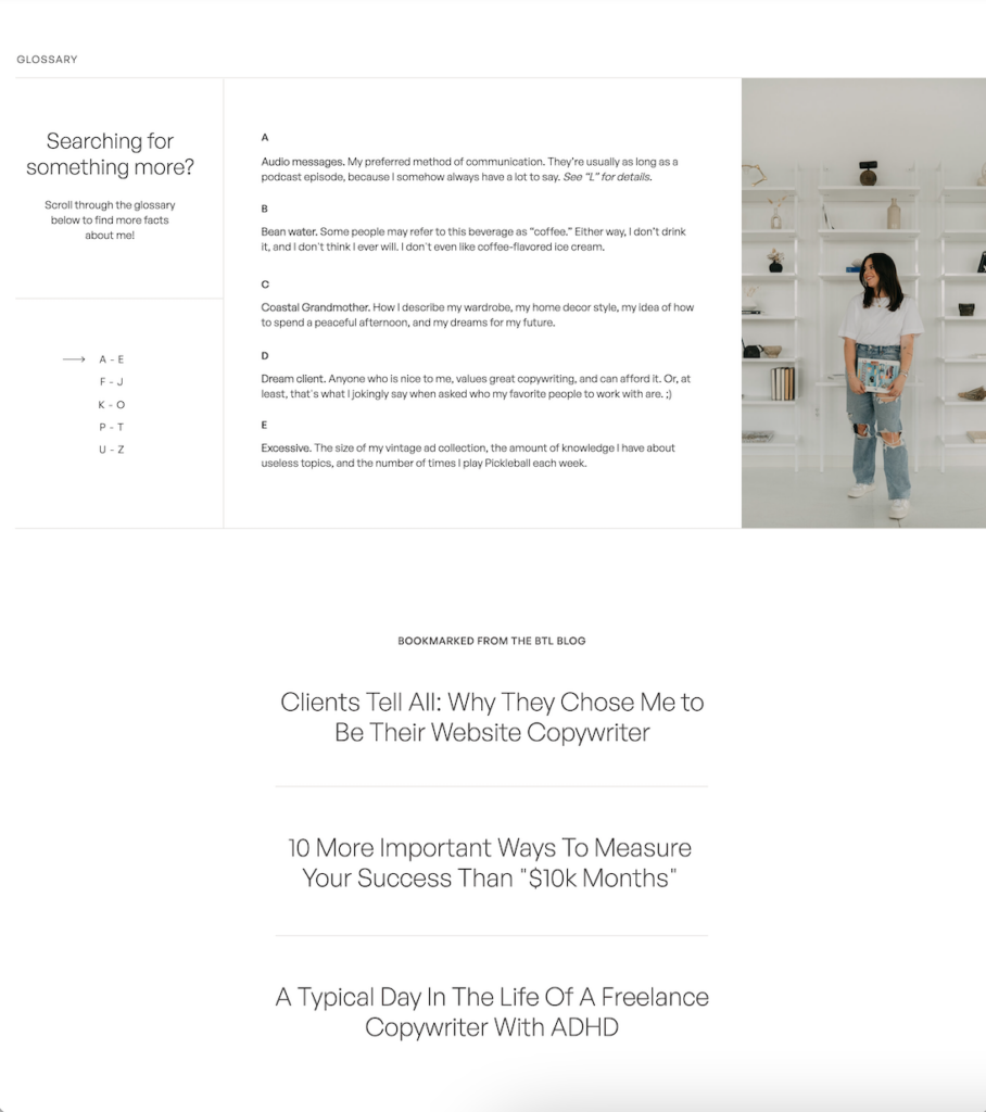
An Innovative and Satisfying Scroll
Sara has so many free resources, it’s borderline insane—so I wanted to make sure that her resources page was scrollable and navigable. It turned out to be both those things, and also incredibly satisfying. (Hint: for most satisfying scroll, you’ll probably want to look at this page on desktop.)
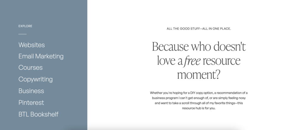
Our Favorite Parts
If you’ve ever designed a website before, you know that feeling when you’re like “I love this website, but I can’t stop looking at ~this one page~. Sara and I have a few of those, but here is my shortlist of favorite sections that I already have 12 screenshots of.
The Glossary
At the end of the about page, you can find a 5-view glossary, listing 26 facts about Sara that correspond to each letter of the alphabet. This section is my absolute favorite—it’s so her, but it’s also incredibly on brand, *and* interactive. Take it for a spin here.

The Copywriting Portfolio
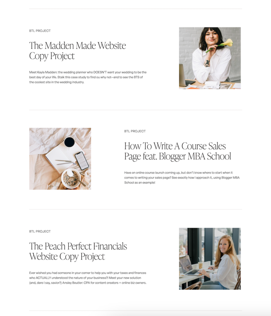
Many copywriters I know have a portfolio in the form of a PDF or links, but Sara does hers blog-style, which I absolutely love. (And it’s even better because Sara knows how important design is, so she keeps it up immaculately.) I love that this deviates from her blog page’s main style and helps us see (visually) that we are tuned in to something completely different. And if you want a real treat, go read some of them—so many smart tactics!
Copywriter Website Launch: The Outcome
In addition to so much praise on Instagram as a result of this launch (because… well, ya gotta), Sara received an unprecedented number of new project inquiries and even hit her highest-earning income month as a creative freelancer directly after the launch of her new copywriter website.
Overall, what people loved most was how true-to-Sara the site stayed, while also feeling like a step up (if that’s even possible for her). And it goes without saying that what I loved was working with a dream client, who also just so happens to be one of my best friends. Win-win.
If you’re interested these kinds of results, I’d be honored to work on a custom website design project together. Can’t wait to chat about yours!
Hi, I'm Sarah Kleist.
Brand & web designer, personal brand strategist, and marketing educator obsessed with the power of connecting with audiences.
SUBSCRIBE TO
ACT BREAK
An actually-fun-to-read weekly newsletter about marketing, design, business, the arts, creativity, mindset and more.
love this post?
share it!
read the next one:
