FILED UNDER:
March 14, 2022
By now, you’ve established that a bomb-ass website is key to success in business. (I mean, of course I’m biased, but I’ve seen the impact of great website design time and time again.)
…However.
No matter how amazing your website is, there are always little ways to improve the user experience. And one of my favorite ways to do that is via a custom thank you page.
Sounds Cool… But What’s a Custom Thank You Page?
Most contact forms are set up to show a message after someone submits—something like “Thanks! We’ll be in touch,” or “Submitted! We’ll get back to you within 48 business hours.”
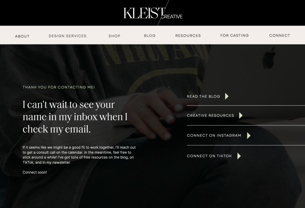
But a better way to do that? With a custom thank you page! Instead of a simple message showing when your contact form gets submitted, you can set it so that your form will re-direct to an entirely new, custom page.
Here’s an example of mine, for context:

Here’s Why You Might Want This
Think about it. If you set it up correctly (keep reading for instructions!), the only people who are ever going to see this page will be leads who have already filled out your contact form.
And if you’re anything like me, you know that when it comes to your leads, the details matter.
Apart from the fact that having one of these pages makes your on-page experience exponentially more refined, here are a few reasons you might employ the use of one of these bad boys:
- It sets you apart. (Most service providers don’t have one!)
- It keeps people on your website longer, which can have an impact on your SEO.
- Depending on what you include on this page, it encourages your leads to keep exploring your content.
- And, depending on what you include on this page, it encourages your leads to connect with you on other social platforms (and thus, establish even more of a connection with you).
Can your simple “Thank you!” message do all that? Probably not 😉
What to Include on Your Custom Thank You Page
I know, I know. You’re totally convinced. 😉 However, you might still be thinking, what can I even put on this kind of page? Here’s a few ideas of sections & links you can include.
A Thank You Message
This one’s non-negotiable, as it is the whole point! Try to make it specific and on-brand, and don’t forget to let them know when (approximately) you might get back to them and/or what they can expect the next step to be.
Connect on Social
You’d be surprised how many people will follow you directly after filling out your form. Just make sure you’re active and/or proud of the content on whatever platform you direct them to, as it will continue to make an impression, whether that’s good or bad.
Read the Blog
If you’re providing value and expertise on a blog, I highly recommend adding a link to it here. This can encourage further trust between you and your new lead.
Link to a Digital Product
Depending on your business structure and offerings, it might be smart to link to a digital product or offering here. However, if your digital products compete with your done-for-you services, you may want to reconsider this.
Sign Up For Email List
Have an active email list? Prompt your lead to sign up for it! This is especially the case if you have a bomb-ass welcome sequence or consistent content that you’re putting out on the regular. Here’s a great blog post (from my biz bestie and copywriter friend) about how to write your welcome sequence. 😉
How to Create a Custom Thank You Page in ShowIt (and Other Platforms Too!)
These instructions are specifically about ShowIt, but the same principals can be applied to any website platform (such as Squarespace, Wix, WordPress, etc). Please note: this will only work if you have an embedded contact form from a third party platform such as Dubsado or Honeybook. It will not work in standard Showit contact forms.
1.) Design Your Page
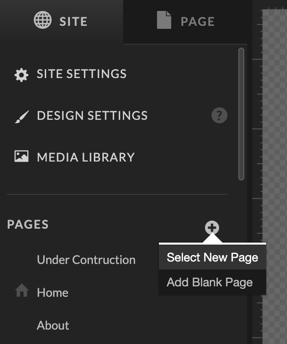
First things first, you’ll need to create your thank you page! If you’re using a template (or have a custom designed site from a designer), the easiest way to do this will be to hit the plus sign at the top right hand side of your Site tab and click “Select New Page”. From there, you’ll be able to choose a pre-existing canvas from your site to plug and play. Alternatively, you could click “Add Blank Page” and design from there!

2.) Change Your Custom Thank You Page Name
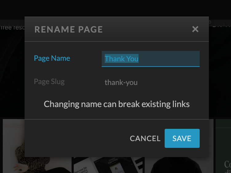
Once the page is designed on both desktop and mobile, you’ll want to make sure to change the page name to something simple like “Thank You”. The page slug that shows underneath the page name will be the ending of your URL. For instance, in the example below, my thank you page will show up at www.sarahkleist.com/thank-you.

3.) Make Sure that Google Ignores the Page
Important (and often forgotten) step! With your custom Thank You page selected, navigate over to the bottom right side of the ShowIt editor. Click the tab that says “Advanced Settings” and scroll to the bottom. Make sure you check the box that says “Ask Google to ignore this page”. (This ensures that this page stays hidden to everyone but those who fill out the form.)

4.) Hit “Publish”
Time to hit publish! But we’re not done yet. The next set of instructions will be specific to Dubsado, but the exact same principal can be applied in any third party CRM system from whom you are using a contact form.

5.) Navigate to Your CRM and Locate the Contact Form Settings
No matter what contact form you have already embedded into your site, there should be an option to “redirect upon form submission.” If you need help locating this, you can Google search something like “form redirect (name of system here)”.
When you find it, enter your custom thank you page URL into the spot allotted.

6.) Hit “Save” and Run a Test
…aaaaaand voila! That’s it! You may want to run a test through the contact form on your website just to make sure it’s working properly. If it’s not, you may need to re-publish your ShowIt website one more time, or update the contact form embed code. But in 90% of cases, you won’t need to touch a thing after these 6 steps.
Custom Thank You Page: A No-Brainer!
Whether it’s your first website ever or your 10th, a custom thank you page is an easy way to level up your user experience. If you’re looking for a designer who thinks of the small stuff like this, you know where to find me. Otherwise, my service provider template comes with this page already designed for you!
Cheers to badass UX. 😉
Hi, I'm Sarah Kleist.
Brand & web designer, personal brand strategist, and marketing educator obsessed with the power of connecting with audiences.
SUBSCRIBE TO
ACT BREAK
An actually-fun-to-read weekly newsletter about marketing, design, business, the arts, creativity, mindset and more.
love this post?
share it!
read the next one:
