
")


FILED UNDER:
April 18, 2022
POV: You’re a service provider, and after months of searching for the perfect brand photographer to help you capture your brand essence, you find yourself deep in an internet rabbit hole and finally land on The One.
WOOOOOHOOOO!
In an excited blur, you *run* to their website to book. And you’re so captivated by their past work & photography style that you skip over all of their website copy. You don’t need to read it—you already know they’re for you.
There’s just one big problem. The navigation menu is confusing and not intuitive, and it’s not clear where the booking page is.
Your excited energy turns into frustration. “Why are they making this so hard?! I want to give them dollars!” And after a few minutes of clicking around to no avail, you give up.
“I’ll look tomorrow,” you think. But tomorrow turns into next month, which turns into never.
RIP to the collaboration of the century—it’s incredibly frustrating for you, and even sadder for them. You lost out on gorgeous new photos, and they lost out on a sale. And alllllll because their navigation menu was confusing and unhelpful.
It probably goes without saying, but navigation is one of the most vital parts of a website’s structure. And while there are a million ways to do it (I’ll be showing you some examples below!), there are some ground rules to having an effective one.
Here’s how to improve your website navigation with 3 easy shifts.
Choose a Primary Action and Make that Sh*t Obvious
First things first, you have to get clear on the primary action you want your visitors to take.
Generally speaking, if you’re a service provider and you want people to hire you for services, the primary action you want people to take is to contact you. Similarly, if you’re primarily selling products, you want people to shop.
And if you’re selling both? You’ll want to make a strategic choice. Maybe your services are booked out, so you want to direct people to your shop instead. Or maybe you’re not always booked out, so your products come secondary.
Whatever your primary action is, the most important part is making it obvious.
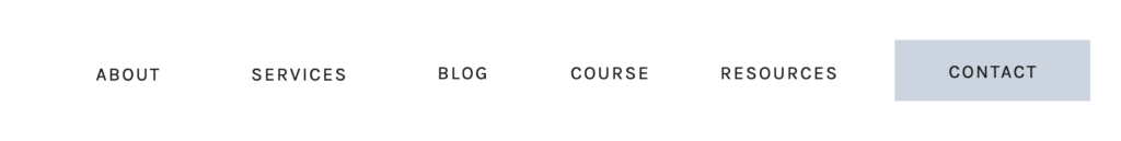
Lots of people choose to do this by making their primary action into a navigation button as opposed to a navigation item. In this example (designed by me!), your eye is automatically drawn to the color of the contact button, and thus, it is intuitive and simple to find.
There are other ways to make it obvious, though, that don’t involve buttons at all. Take this example from India Earl Photography (designed by Soul Twin Studio):
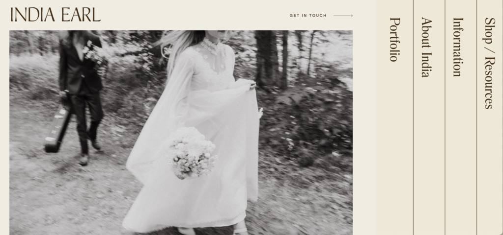
I’d argue that her primary action is “Shop” (because I know her services book out pretty far in advance) and your eye can easily spot it because it’s the only line with two options.
Regardless of how you lay it out, make sure that your primary action is more than obvious.
Don’t Use Too Many Links
One of the most common problems I see with navigation menus is people having waaaaaaay too many links. If I could only give one piece of advice for how to improve your website navigation, this is the #1 thing.
In 1995, Columbia University conducted a study about choice paralysis in the form of selling jam. In the study, they deduced that in theory, customers were drawn to the business that sold a ton of different flavors of jam. But in practice, they spent more money at the business that only offered a few select options.
Choice paralysis is a real thing. And in terms of your navigation menu, that means limiting it to 6-7 links max.
Whenever I visit a website that has more than 6 or 7 links in their nav, I am immediately overwhelmed. I have no idea where I’m supposed to go. And I usually “x” out pretty damn quick.
Don’t overwhelm your users! Whittle those links down to the most important, and if you have extras that you simply must find a place for, you can link to those pages within your main pages and/or put those in the footer instead.
Consider Your Ideal Audience
Once you’ve got your primary action & have narrowed down the most important links you want to feature in your navigation, it’s time to plan out how you want to lay it out.
As a designer, this is my favorite part.
However, you must consider your ideal audience before choosing.
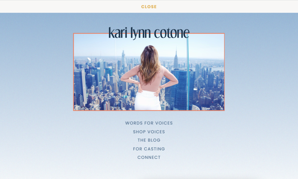
If your ideal audience is more tech savvy (or you think they spend a lot of time on websites), you might consider something a little less traditional. For example, here’s a dropdown menu I designed for copywriter Kari Lynn Cotone. You can access it by clicking the word “peek” at the top of her website.
However, if your audience is a little less tech savvy (or maybe you serve a wide variety of demographics), you may want to stay the more traditional route. A main bar on top with your logo either to the left or in the center will do just perfectly for them.
How to Improve Your Website Navigation Design
You might be thinking, ok cool! Buuuuut, I’m not a designer. Help!
The only real science to designing your nav is to make sure the spacing between each of your links is even. So if you’re currently working in ShowIt (or another program that doesn’t do the spacing for you) and wondering how to improve your website navigation design, there are a few options:
- Use a template! There are tons of pre-built ShowIt website templates on the market (and *cough cough*, I’ve got some too)!
- Hire a designer for a day—this is an especially good idea if you have a laundry list of stuff you want to improve, tweak, or fix… navigation included.
- Go on Pinterest and find some new ideas. One of my favorite terms to search is “website design inspiration”. Although, I’m biased.
However you get there, structuring and formatting an intuitive navigation menu is vital to the success of any website, and I hope this was a helpful framework from which to approach it. Happy designing!

Hi, I'm Sarah Kleist.
Brand & web designer, personal brand strategist, and marketing educator obsessed with the power of connecting with audiences.
SUBSCRIBE TO
ACT BREAK
An actually-fun-to-read weekly newsletter about marketing, design, business, the arts, creativity, mindset and more.
love this post?
share it!
read the next one:

")
")
")