FILED UNDER:
August 6, 2022
Think building an entire website in one singular day is impossible?
Think again!
Kari from Kari Beckett Design hired me in July 2022 for my Website in a Day package, and it is legitimately one of my favorite sites I’ve ever done.
And shhhhh! Don’t tell anyone but… it’s completely custom.
🤯
Now, normally, my website VIP days are meant to start from a template. Because building an entire custom site in a day? It’s usually not realistic. And when Kari signed on to work with me, our plan was to work from a template she had previously purchased.
Buuuut, when I logged into her ShowIt account the morning of (and saw all the photos of her gorgeous interior design work), a bolt of inspiration just HIT ME and I had a few fresh ideas for the first few sections of the homepage.
And once those were built, I kept going.
Aaaaaand kept going.
And kept going!
Until finally, when I sent her the completed homepage draft, and she said “Omg, IT LOOKS SO GOOD! NO REVISIONS!”
No revisions, you say? 🤔 Incredible. 😈
And that’s when I knew I’d be able to build the entire site from scratch in one singular day.
Now here’s the thing. If you’re familiar with my case study series, you know that I like to dive deep into the design challenges, design solutions, why I made certain choices and the miniscule details about how it all went down. But! Since Website in a Day projects require so much speed, and a laser focus to hit the finish line on time, I’d be lying if I said I remembered ANY of that for this project.
(I mean, honestly, I blacked out.)
So, let’s keep it simple, shall we?
The Major Adds
Before Kari worked with me, her site was doing its job. It listed her services, some details, introduced us to Kari and her design style, and presented her past work. But its UX was confusing, and the content structure on each page left a bit to be desired. So, one of my first tasks was to organize the content in such a way that made sense from a viewer’s perspective. And the page where those changes made the most impact?
The Homepage
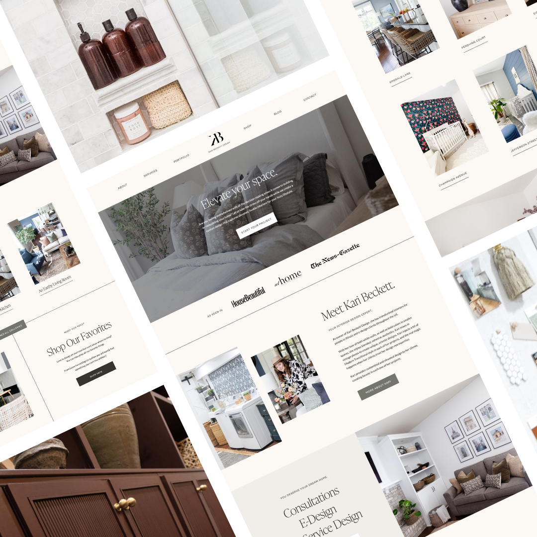
To me, a great homepage gives us a little slice of life from allllll of the rest of the pages and content on the website. So in Kari’s case, that meant building out a space to introduce herself, present her services, show off her portfolio work, lead us to the shop & blog, and provide free value in the form of a lead magnet.

The Shop
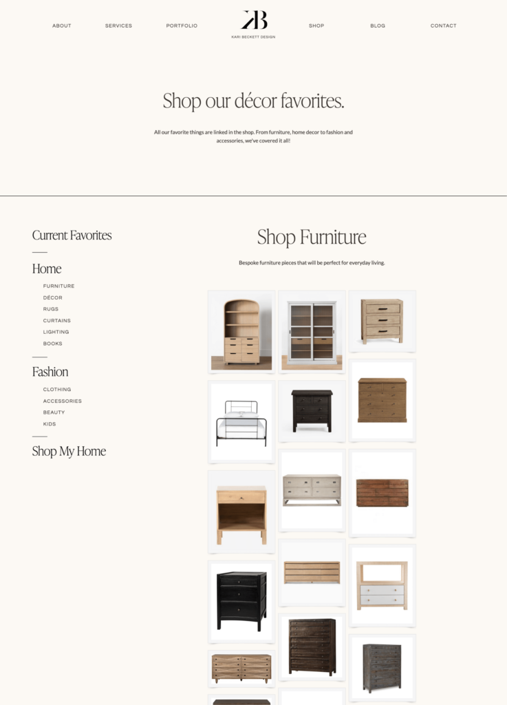
When Kari came to me, she knew she was missing out on the passive income life that many interior designers have learned to benefit from—affiliate links. So, she asked if we could build out a home on her site to drive traffic to her favorite furniture pieces (and eventually earn that affiliate income).
Naturally, I said yes, and it was a super easy implementation process. We used LikeToKnowIt’s embeddable Boutique function to create the different shop-like categories and it was done in a breeze!

The Blog
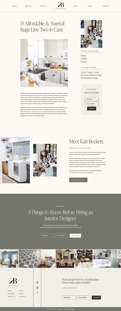
Every good service provider website features a blog—AKA, free content to draw viewers in with your expertise and get them to know, like, and trust you. Kari had a blog before we worked together, but the user experience was a bit confusing, and the blog posts were hard to read. I had so much fun reworking the blog to make it easier to consume, but also drive viewers to other (money-makin’!) parts of the website.

And then… SEO?
By the end of the day, Kari was so excited about her brand new website that she inquired about doing another VIP day just to optimize SEO. Of course, I jumped at the chance.
Together, we discussed her current searchability challenges—the fact that she serves clients both locally and virtually. So, with after a bit of keyword research & competitive analysis, we were able to optimize Kari’s beautiful (can I say that?!) new website to be found on Google. I also provided her with a few blog post ideas based on keywords that kept popping up in the research, as well as an overview of how to blog for SEO.
The Impact
In just one day of design and one day of SEO, I was able to hand off the new site to Kari with complete instructions on how to fill the copy in and do upkeep on her new site. And because we got it all done so quickly, she was inspired to write the copy over the next weekend and launch ASAP! (Seriously, might be my quickest launch EVER.)
Soooo, go take a look at the site and see for yourself!
And if you’re interested in what a Website in a Day package might look like for you, let’s chat about it 😉
Hi, I'm Sarah Kleist.
Brand & web designer, personal brand strategist, and marketing educator obsessed with the power of connecting with audiences.
SUBSCRIBE TO
ACT BREAK
An actually-fun-to-read weekly newsletter about marketing, design, business, the arts, creativity, mindset and more.
love this post?
share it!
read the next one:
