FILED UNDER:
July 8, 2024
There’s nothing more creatively exciting as a designer than when someone pulls me out of my comfort zone, and that’s just want Nikko Kimzin at Kimzin Creative did when he hired me for his design project.
Nikko is a lot of things; he’s an artist, a leader, a strategist, and consultant; basically, if there’s anyone you need on your team to help streamline your story and bring it to life, he’s your guy. So when he approached me a few months ago to help him build a brand and website that reflects the joyful, modern edge that his company brings to all their projects, I jumped at the chance.
…and I am truly SO proud of the result.
Read on to learn all about the process, from conception to execution!
The Project
Kimzin Creative does it all—from arts & education programming, to consulting, producing, and even corporate team building. At the heart of it, Kimzin Creative is all about bring structure to art-filled spaces, and art to artless spaces. (AKA: bridging the gap between business & creativity!)
However, when Nikko came to me, Kimzin Creative needed a visual identity. The website lived on his actor website (which, no shame, because I personally love combining my passions onto one site—but it was not the vibe that Nikko was looking for).
So, we got to work.

Goals & Deliverables
Among our list of goals for this project included:
- Carve out a new visual identity, creative direction, and overall vibe for the brand & website to be based on.
- Keep the content minimal and sleek, while also giving an air of trustworthiness.
- Make sure it feels equal parts fun, editorial, and edgy.
- And all in the service of giving potential new clients a safe place to land on the internet that they feel both excited and intrigued by!
Design Challenges
Most of the clients I work with are looking for something clean, simple, and elevated. And while I absolutely adore that style, this was NOT that vibe!
Nikko expressed that he absolutely wanted to use a vibrant shade of yellow (paired with black and white), and he also had a few visual examples of work that inspired him. Within this inspo, there were lots of graffiti-like elements—very much artsy street style.
Thus, the biggest challenge was finding a shade of yellow that could pop on both black AND white (visual accessibility is important!), an establishing a visual structure that was creative enough to meet the graffiti vibe, but also would be legible enough to read the information he wants his users to understand.
Design Solutions
Here’s how we were able to create a unique, artsy, street-style website for Kimzin Creative.

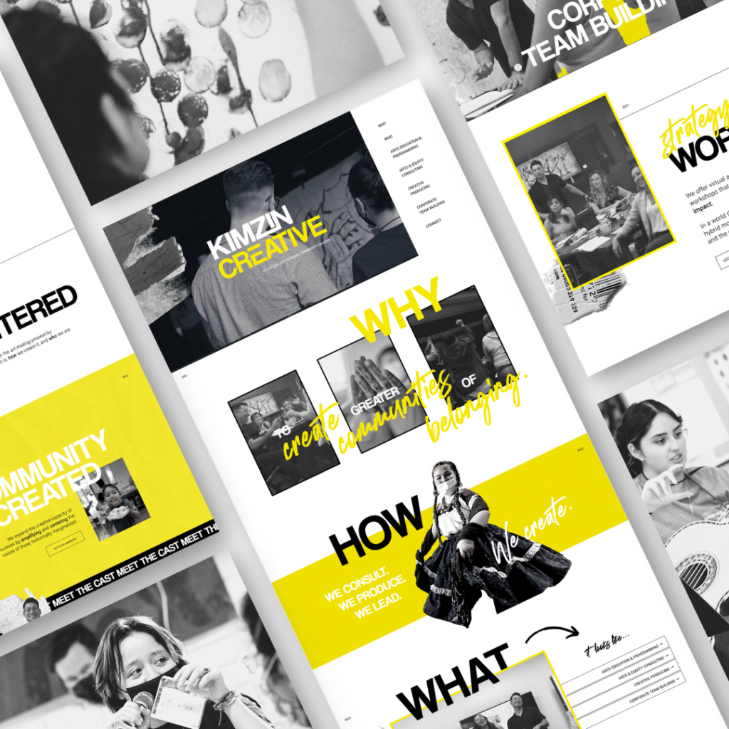
A Statement-Making Type Suite
To capture Kimzin Creative’s vibrant energy, we knew we needed a typography suite that could really make a statement. We started with a bold sans-serif for headlines – it’s got just enough personality in its slightly rounded edges to command attention without shouting. This font says, “I mean business, but I’m cool and collected.” For body text, we opted for a clean, modern sans-serif that complements our headline font perfectly.
But here’s where we really dialed up the creativity: we incorporated a custom graffiti-inspired font for select accents and important words. This touch of street art flair is like a wink to Kimzin Creative’s artistic side.And the result? A type combination that strikes the perfect balance between professionalism and artistic edge. It’s equally at home in a corporate boardroom or a funky art gallery – just like Kimzin Creative.

Ripped Paper & Textured Elements
To further embrace the street art aesthetic against the otherwise minimalist site, we incorporated a variety of textural elements throughout the design. These torn elements add a raw, draft-like feel to key sections of the website, creating visual interest, a sense of depth, and that lived-in, artistic vibe Kimzin Creative was after. These textures appear in backgrounds, hover effects, and as accents to important content sections. The key was finding the right balance – we wanted the site to feel artistically edgy without compromising on professionalism or readability.

Expandable Sections
We knew Kimzin Creative had a ton of cool projects to show off, but we didn’t want to overwhelm visitors with a wall of text. So, we got clever with it. We created expandable sections for each project Nikko wanted to showcase.
At first, you see a quick snippet about each project – perfect for scrolling and getting the gist. But if something catches your eye— just click, and you get all the juicy details, case studies, and associated visuals.
This setup keeps things tidy for the casual browser while giving the detail-hungry folks plenty to chew on. Plus, it’s just fun to click around and discover all the awesome work Kimzin Creative does. It’s all about giving visitors control over their experience – which is exactly the kind of thoughtful touch Kimzin brings to their own projects.
Designing Outside the Lines
This project was both a huge creative challenge and a true joy. Here’s what Nikko had to say:
“Artists need boundaries in order to create. We need curation and direction from like minded collaborators. Kleist Creative approaches design through the lens of storytelling – what tactics visually/graphically will have what impacts on your desired audience. These boundaries allowed me to best tell the story of my business while centering our audience in a creative way. WEBSITES REQUIRE SO MUCH CONTENT (written, photos, video, layout..etc). Sarah was gracious and generous with timelines in allowing me to gather quality content that reflects our mission and lures in prospective clients. Her selection and curation of images, text and layout allows for a feast for the eyes (while highlighting our services). If you’re looking for a FUN, collaborative partner to guide you through the branding process of how your business lives visually online – click that link hunney.”
You heard him! 🙂
Hi, I'm Sarah Kleist.
Brand & web designer, personal brand strategist, and marketing educator obsessed with the power of connecting with audiences.
SUBSCRIBE TO
ACT BREAK
An actually-fun-to-read weekly newsletter about marketing, design, business, the arts, creativity, mindset and more.
love this post?
share it!
read the next one:
