FILED UNDER:
December 11, 2021
So, you want to list prices on your website. Or maybe you don’t actually, but you’ve been told you should. Bestie, you’ve come to the right place.
First things first, yes! I think 90% of service-based entrepreneurs would benefit from listing their prices publically. While I wouldn’t recommend it for all (and have certainly worked with clients in the past who didn’t want to), chances are, if you’re reading this, you fall into that 90%.
I didn’t always believe this, even for myself. I thought that my audience was too broad and their budgets too diverse—the last thing that I wanted to do was to scare anyone off by having actual numbers published. It wasn’t until I was so overwhelmed with too many inquiries that I finally said, okay, time to make a change.
And the whole gag is, we’ve all been on the other end of this, too. How frustrating is it when someone doesn’t have their prices listed? How often do you actually reach out to them for a quote? Or do you just say “eh, nevermind I guess” and continue on your way?
Quick storytime before we continue: recently, I was searching for a physical therapist, and I noticed most of them were out-of-network providers—which is a whole other tangent we will save for another day—but none of them listed their session rates on their website. Here I was, in desperate need of physical therapy and already so frustrated because 1.) I was in pain but 2.) I knew I was going to have to spend out-of-pocket money on a health issue. The feeling was made even worse by the fact that no one could just list what they charge!
So, should you list prices on your website? Yes. Probably. But how? Here’s a few different ways that I’ve found work the best.
1.) The Most Common Way to List Prices on Your Website: A Pricing Page
Best For:
Entrepreneurs with tiered services or if your prices need a more complex explanation.
I love a good ‘ole pricing page. (I’m partial, because this is what I have.) My favorite part about it is that it serves as a main hub for everything I offer. And since I have designed my services to live at different price points (based on the needs of different kinds of clients), it gives people the chance to compare and contrast my offers, figure out what might be the best one for them, and move forward to my inquiry form with confidence.
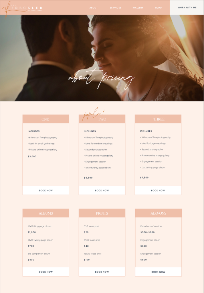
The other great thing about having a live pricing page is that you can change the numbers whenever you want, and they will always be current, no matter when your potential client peruses it. This method works great for coaches who have different packages, photographers who shoot different kinds of events, event planners, you name it. Here’s an example of one I set up for a wedding photography client.

As you can see above, a new potential client can easily compare and contrast her different services and likely find a package that works for them. This is why I love a pricing page.
And the best part about having a pricing page? There’s two different ways you can get people there.
Popular: Feature it in the Navigation
The most common way to feature a pricing page is to put it in the navigation menu, likely right after “services”. Next time you’re searching the web, you may notice that lots of platforms and tech companies do it this way because it’s easy to access and people know where to look for it. But you can also employ…
My Favorite Way: Hide it Behind an Email Signup
If you use an email marketing platform like Flodesk or ConvertKit, this is the way I recommend setting up your pricing page. You can do this by creating a new form in your email platform and adjusting the settings to re-direct upon form submission. When it prompts you for the URL you’d like to re-direct to, enter your pricing page’s URL.
Next, you’ll want to create a new section on your services page and say something like “enter your email to access the pricing guide”. Then, underneath, you’ll embed the email form that you just created. And voila! When someone puts their email into the form, they’ll be automatically taken to the pricing page on your website.
I adore this method because 1.) it weeds out the people who don’t really want to work with you. If someone can’t put their email in a form, they likely aren’t actually serious. And 2.) you can see exactly who is looking at your pricing page in real time and potentially connect further, if you choose to.
2.) The Most Foolproof Way to List Prices on Your Website: On Your Services Page
Best For:
Entrepreneurs who have one service offering or for those whose pricing may not need a whole breakdown.
If you don’t have a ton of complicated packages or a list of deliverables to compare and contrast with other offerings, then listing your pricing directly on the services page might be the move for you. A big pro about doing it this way is that you don’t have to get folks to click to a bunch of different pages (or enter their email address) to get all the info.
People are lazy, and you have to account for that sometimes.
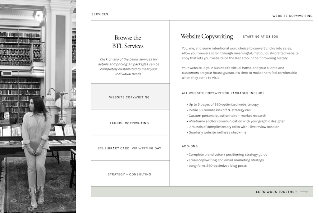
Also, sometimes it just doesn’t make sense. If you don’t have enough content to justify a whole pricing page, then why create one? Here’s an example of a services page I designed for my business bestie, Between the Lines Copywriting. She is not new to biz, but we decided that listing her prices directly on her services page made the most sense for her and the flow of the site.

3.) The Most Customizable Way to List Prices on Your Website: Via a Downloadable Guide
Best For:
Those just starting out or those not working with a website designer.
Similar to the pricing page redirect email form that I mentioned above, you could also list prices on your website via a downloadable PDF that gives them all the information. This method works great for people who are just starting out, because there are hundreds of pricing guide PDF templates available for purchase on websites like Creative Market and Etsy.
I don’t usually recommend this method to my clients, because if they’re working with me anyway, I might as well design one for them on their live site. But if you don’t have a website yet, or you’re not working with a designer. I recommend buying one of these! Then, in whatever email marketing platform you use, you can set it up to be delivered to your potential client like a lead magnet and keep track of your leads that way.
Lots of people find success with this method and swear by it. There is one big con, though. Let’s say you send your prices to someone this way in January, but then you raise your prices in May. If they come back to you in September expecting your old price (because they have your old PDF), it might be awkward. This is why I’ll always recommend a pricing page over a pricing guide.
4.) The Most Sneaky Way to List Prices on Your Website: In Your Contact Form
Best For:
Those who really don’t want to, but know they need something.
If you reaaaaaalllllly don’t want to list your prices on your site (imposter syndrome? Too many complicated variables?), a good way to give people an idea of how much you charge might be in your contact form. I’ve seen this quite a lot, actually.
It all happens with the magic question: what is your budget? And the most important part: set it up so that there’s a dropdown box with different potential ranges.
If you’re using ShowIt, you will have to use a third-party platform to create your form, like Honeybook or Dubsado. (You can’t create a dropdown directly in ShowIt.) But if you do choose this method, don’t skip the dropdown. It’s the most important part!
By giving range options, you can still enjoy the fruits of being vague while also establishing a “lowest price”. Oftentimes, this is enough to weed out the folks who can’t afford even your base.
However, this method can turn some folks off—lack of clarity can be frustrating to customers.
Bonus Tip #1: Utilize “Starting At”
The biggest qualm I hear about listing any prices at all is this: people say, “but Sarah, what if a huge company approaches me about doing their xyz, and my prices (normally geared towards small businesses) are too low?” Allow me to introduce you to two amazing words:
“Starting at”.
No matter how you list prices on your website, you should always use “starting at”. In fact, when it comes to services, I’ve learned that projects almost always have to be custom-quoted anyway. And even if you do always use your standard price, you never know if you’re going to have a client ask for something wayyyyy out of scope.
“Starting at” lets your audience know that your pricing is intentional, value-based, and carefully crafted specifically for them. It also lets them know your absolute base and gives them a general idea of how much they need to budget for to work with you. All around, BIG fan of “starting at”.
Bonus Tip #2: List Prices in Your Instagram Highlights
If you’re feelin’ reaaaaal good about your pricing, create an instagram highlight! Oftentimes, it’s tough to get people to click that “link in bio”, so if they can get the information from you directly on IG, then that’s the tea. That way, they can pre-qualify themselves and head to your inquiry form (or even your DM’s) to get started.
The best way I’ve seen people do this is by creating a few story graphics in Adobe Illustrator (or Canva, if you’re not a designer), listing their services and packages, and including the price directly on the slide. The downside is that you do have to post these all to your story in order to be able to use them as a highlight, but in the online biz space, I feel like people are pretty used to it. (And you can always post something beforehand like “updating my services highlight, skip if you want to!”)
All in All, Transparent Pricing is Clear and Kind
Whether you’re just starting out or you’re a seasoned entrepreneur, I do recommend listing your prices. Clear is kind, as Brené Brown says. And besides, you’ll be shocked at how much time you save by not hopping on a zoom call with every single person who’s interested, only to find out that they can only afford to pay you 5 dollars for 3 weeks of work.
If you’re looking for a web designer to help you map out the best solution for you, I’d be honored to help. Check out my pricing page to figure out what package might be best for you… and since you read this far, I won’t even make you sign up for my email list to get there 😉
Hi, I'm Sarah Kleist.
Brand & web designer, personal brand strategist, and marketing educator obsessed with the power of connecting with audiences.
SUBSCRIBE TO
ACT BREAK
An actually-fun-to-read weekly newsletter about marketing, design, business, the arts, creativity, mindset and more.
love this post?
share it!
read the next one:
