FILED UNDER:
January 15, 2024
Don’t tell custom design I said this, but Website in a Day is my favorite service to offer. (Eeeeek!) There’s something about the time constraint that allows my brain to function best under Parkinson’s Law—the idea that all tasks will fit within the time limit you give them.
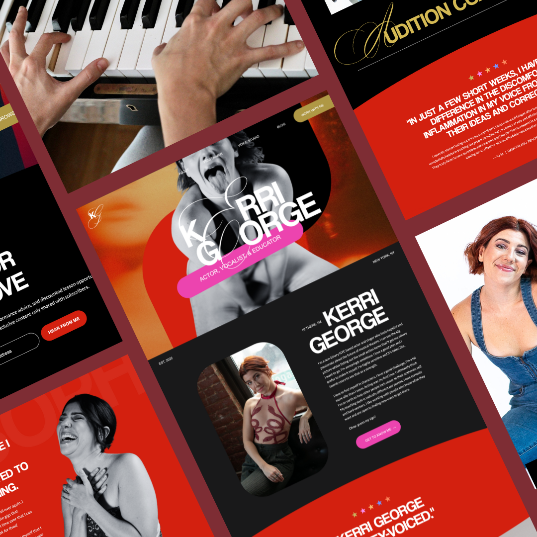
That was certainly the case for Kerri George’s website—which quickly made its way up the ranks to being one of my favorite design projects ever. (And I’ve designed over 125+ websites now, so that’s saying something.)
Let’s dive into how I made it happen!
A Little Backstory
Kerri is a New York City based actor & voice teacher. I first met them years ago when I understudied them as Veronica in Heathers the Musical—which, if you haven’t seen their rendition of Dead Girl Walking, you’re MISSSSSSING out.
I’ve admired them from afar since the show closed—I truly regard them as one of my absolute favorite singers in New York City—so 8 years later, I was delighted to see Kerri sign up for my business class for artists in spring of 2023.
ICYMI, I taught a 6-week class called Quadruple Threat designed to help actors and performing artists start their own businesses and eventually quit their survival jobs. (Stay tuned for more info about this, because it’s coming back in a different format this year!)
Kerri used the class to finally go all-in on starting their own voice studio. A few months after the class ended, Kerri reached out about doing a Website in a Day. And because I already KNOW how badass they are, I was like, “Absolutely yes, I’m dYiNg to do your site.”
The rest, they say, is history.
Goals & Deliverables
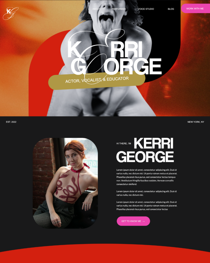
Kerri came to our kickoff call with a clear vision for the brand & site (which is super duper important for Website in a Day) AND photoshoot content that combined perfectly with the vision.
Among our list of project goals included:
- Customize my Narrative template to “make pink and red masculine”
- Include pages: Home, About, Performing, Teaching, Blog, and Contact
- Define a font hierarchy and color scheme that accurately reflects Kerri’s vibe
- Turn Kerri George Studio into THE coolest and most welcoming studio in NYC (and on the web)
… and not to toot my own horn, but… I think we did it. 💅🏻
Design Challenges
Of course, with any Website in a Day project, the time constraint itself becomes a hurdle. For this website, however, a bigger hurdle was this: how do we make the site as cool and edgy and bold as Kerri is, while NOT making it scary or “too cool for school”? How do we make them feel just as welcoming and warm as they do edgy and forward-thinking?
Design Solutions
Here’s how we solved those design challenges to create a site that feels perfect for Kerri.
Warm and Bright Color Palette
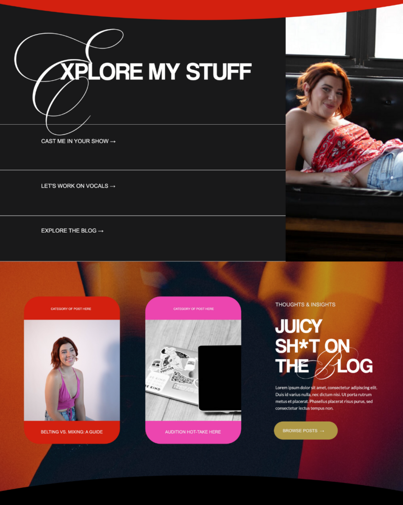
Cool tones? We don’t know her. In order to balance the rebellious edge of the blacks and charcoals I was sure we’d use, I knew we’d need to use bright and warm-toned reds, pinks, golds, and even a little purple to convey a sense of friendliness and fun. Together, the editorial charcoals, blacks, and whites contrast well with the equal amount of color throughout, and give us that feeling of friendliness and edge we were looking for.
A Combination of Rounded Edges and Straight Edges
Similar to the color pallete, I knew we’d have to combine edge and friendliness in shapes, as well. Elements like images with rounded corners and pill-shaped buttons convey warmth, while the use of straight lines convey edge and structure. Together, they create a harmonious balance between the two inner “worlds” we were seeking to convey.
Combination of Sans Serif and an Ornate Script
Pivotal to this creative direction was the idea of combining the energy of masculine and feminine. Again, similarly to the colors and shapes, we wanted to emphasize a duality. Hence, the use of an extremely ornate script font to dress up a rather blocky, sturdy sans serif. I loveeeeeeeeee the combination of these two fonts, and I think it perfectly conveys the vibe.
Last But Never Least, Well-Sourced Stock Imagery
Kerri came with perfect photoshoot content for the site, but I knew I’d want to add some bolder, more textured elements for backgrounds and pops of color throughout. So, I spent an hour or so sourcing quality stock to help us bring those backgrounds to life a little bit, and I think it made all the difference. It makes the site feel more ethereal than it would without.
My Favorite Parts
The Hero Sections
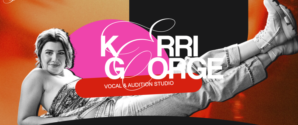
I am absolutely obsessed with how the hero sections (AKA the very first sections) turned out throughout the site. Having Kerri as a pop-out feels collage-y and edgy and artsy and fun and friendly in all the right ways, and I just KNOW that it captures the attention of anyone who lands there.
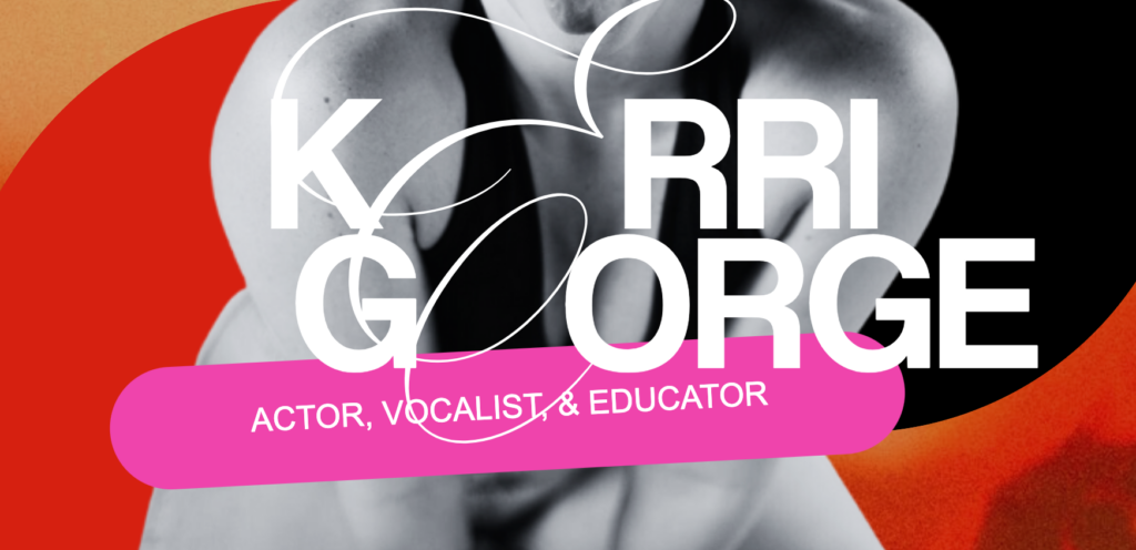
The “Double E”
When I was first playing with the script and sans serif together on “Kerri George”, I had only replaced the E on Kerri, not on George. When I sent to Kerri, they asked if it would look cool for both E’s to be gone, so I tried it—and holy sh*t, it worked. I love how this looks, and I love even more that it was a collaborative effort to get there.
Kerri George Website Launch: The Outcome
I can obviously only speak for myself here, but I’M OBSESSED. Texts from Kerri throughout the day include:
- “omg losing my mind”
- “ITS SO COOL OMG UR MAKIN ME LOOK SOOOOOO COOOLLLLLLLL”
- “Oh my god I am freaking out”
- “Its so fucking good”
- “SO FUCONGGGGG GOOOOODDDDDD”
….verbatim.
Want this to be you? I thought you’d never ask 😉 Check out all the details about Website in a Day here, and inquire here!
Hi, I'm Sarah Kleist.
Brand & web designer, personal brand strategist, and marketing educator obsessed with the power of connecting with audiences.
SUBSCRIBE TO
ACT BREAK
An actually-fun-to-read weekly newsletter about marketing, design, business, the arts, creativity, mindset and more.
love this post?
share it!
read the next one:
