
")


FILED UNDER:
July 4, 2022
With so many template options on the website design market (not to mention platforms like ShowIt that make it easy to update your website yourself), DIY website design is a great way to get your business up and running.
However, since half of my job is surfin the web, I’ve seen a loooooot of little things out there that I’d wanna tweak. And the best part? You don’t even have to be a designer to notice them. (In fact, after you read this, I’m sure you’ll notice them everywhere.)
Here are the most common website design mistakes and how you can avoid them.
Crowding the Design
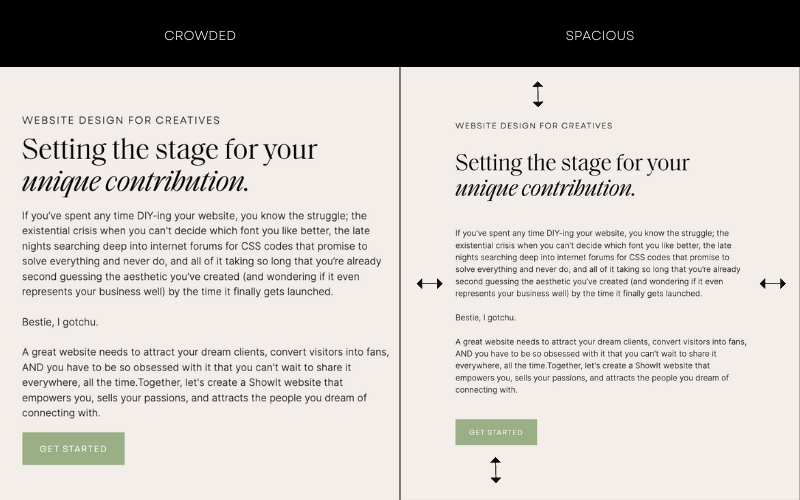
Crowding is the singular most common website design mistake I see (and funnily enough, it’s the easiest one to fix). Take the example from my website above. Which side are you more compelled to read?
On the left, there are extremely small margins and no breathing space between the headings, subhead, paragraph, and buttons. If someone’s scrolling and skimming by quickly (which, let’s be honest, who ISN’T?!) they’ll miss the important subhead completely.
When you give your design more room to breathe, it makes us feel like there’s actually less content to “sift through”. So while the site might end up being longer as a result, your audience will make it farther down the page.
Not Following a Defined Font Hierarchy
What is font hierarchy? Techopedia defines it as “a system that uses typography – the size, font and layout of different pieces of text – to create a hierarchical division that can show users where to look for specific kinds of information.”
AKA, your title, heading, subheading, and paragraph fonts.
One of the benefits of working with a designer is that they’ll give you a font hierarchy to use alongside your brand colors, logos, and other assets. But, if you’re DIY-ing, you’ll have to create one yourself.
And not creating one is an extremely common website design mistake to avoid.
If you’re not a designer, here’s a few good rules of thumb.
- Overall, you’ll want to pick three fonts. A heading font, a subheading font, and a paragraph font.
- They must ALL be extremely legible, but especially the paragraph font. (Super funky and ornate fonts are to be used for logos and design elements only.)
- Subheadings always look best as an all caps sans serif.
- Pro tip: match your button font to the subhead font for the cleanest look!
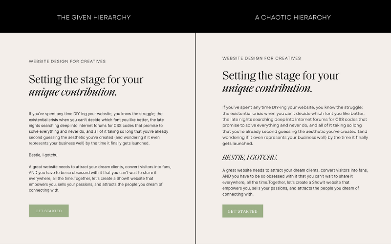
And once you pick your hierarchy, STICK WITH IT! In the image example above, you’ll notice that the left hand side has a clearly defined subhead, heading, paragraph, and button that matches the subhead.
The example on the right feels much more chaotic. There’s like 6 different font stylings happening and your eye doesn’t know what to focus on.
Create ease for your audience. Stick with a clearly defined font hierarchy.
Not Using Enough Images
A picture is worth a thousand words.
No, but actually.
Fonts & typefaces are my jam, but words on a page can be extremely overwhelming without enough images to compliment them. Take this for example:
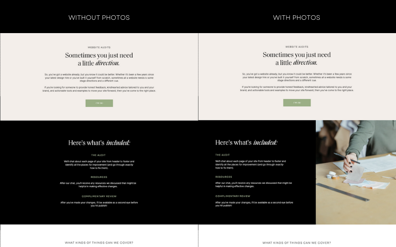
Images allow us to break up the layout into different sections, create balance, and inspire visual interest. (I’m also a firm believer that photos are the most important thing to invest in when you’re just starting up, so if that’s you, RUN to book your brand photographer rn!!!!)
While getting brand photography is the most costly of the common website design mistakes to fix, they will serve you *so* well (sometimes for years to come!).
Buuuuut, the best way to avoid common website design mistakes?
Hire me to nip ’em in the bud from the beginning 😉
You knew I’d say that.

Hi, I'm Sarah Kleist.
Brand & web designer, personal brand strategist, and marketing educator obsessed with the power of connecting with audiences.
SUBSCRIBE TO
ACT BREAK
An actually-fun-to-read weekly newsletter about marketing, design, business, the arts, creativity, mindset and more.
love this post?
share it!
read the next one:

")
")
")