FILED UNDER:
November 20, 2022
Y’know those people who come into your life and you feel like it’s such a great creative match that you were destined to work together? That’s how I felt about working with Alethea of Copy with Spice.
We met as any great collaborators meet these days; through a friend. (AKA, through my biz bestie Sara from Between the Lines Copy, who also happens to be Alethea’s mentor. PS, if you’re looking to build a sustainable copywriting business, check out Sara’s mentorship options on her website!)
So I was thrilled as hell when Alethea wanted to work on the entire package—photoshoot art direction, branding, & custom website design combined. And as a result, this project turned into one of my favorite sites I’ve ever worked on. Here’s how it all went down!
The Project
Copy with Spice is a freelance copywriting business specializing in—you guessed it—copy with spice. Alethea realized that one thing often missing from the copywriting space is a focus on personality. (And after meeting her in person at the ShowIt conference a few weeks ago, I can tell you she is not lacking on the personality front!)
So, Alethea set out to build a business the right way from the beginning by hiring a mentor (that’s Sara!) and a designer (that’s me!) to help her build her brand.
Quick pause to talk about the whole “building a business the right way from the beginning” comment: as someone who certainly did not build her business the right way from the beginning, I can assure you that you don’t have to do it this way to be successful. Buuuut, if you’ve got some money saved and are willing to take that leap from the jump, you can save yourself a whole lot of heartache, 14 hour days, red flag clients, anxiety, and bad situations. Okay, off my soapbox now.
The Goals & Deliverables
When Alethea came to me, she expressed that she felt she felt her energy was in between two visual worlds; 1.) an earthy, grounded, boho type aesthetic and 2.) a more editorial, rebellious, high-end kinda vibe. Adding to that challenge, we both wanted the idea of spice to be represented literally in some way. (Because be honest—when was the last time you saw a copywriting brand use jalepeños as imagery?) So, we set out to create something that met all these visual criteria via….
The Copy with Spice Deliverables
- New overall creative direction of her brand
- Photoshoot art direction based on creative direction
- Branding; type suite, color pallette, and logo marks
- Website design & development
- Basic SEO implementation
Design Solutions
The best part about design (and frankly, why I love it) is that it can solve an incredible amount of challenges and problems. Here are a few of the design solutions we implemented to give Copy with Spice a zesty new online home that speaks to her ideal client and levels up her brand tenfold.
Photoshoot Art Direction
Here’s a hot take that I’ve expressed before but always bears repeating: photos are the most important element of your brand & website.
Without great photos, you cannot create a stunning brand. Full stop. (Ahem—this is why I created my photoshoot art direction package!)
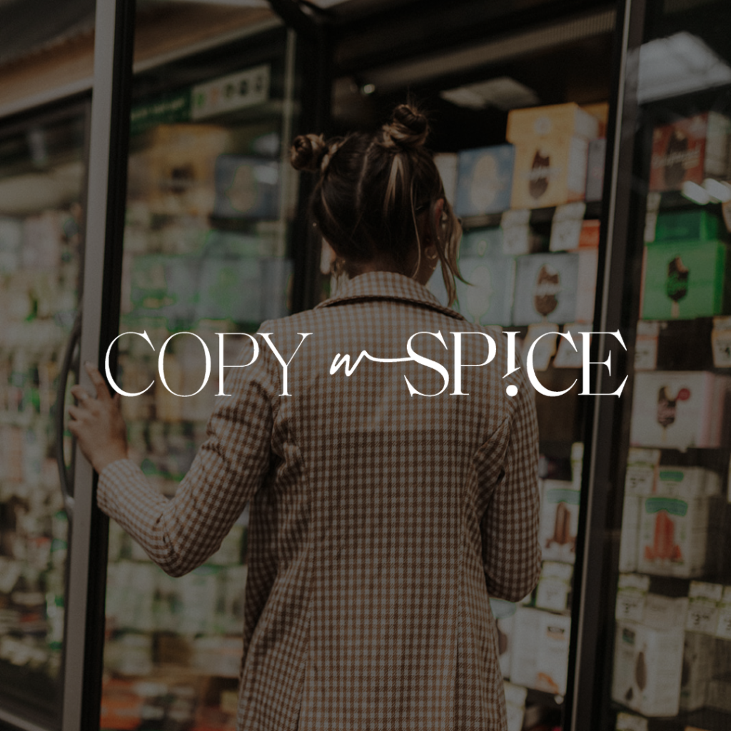
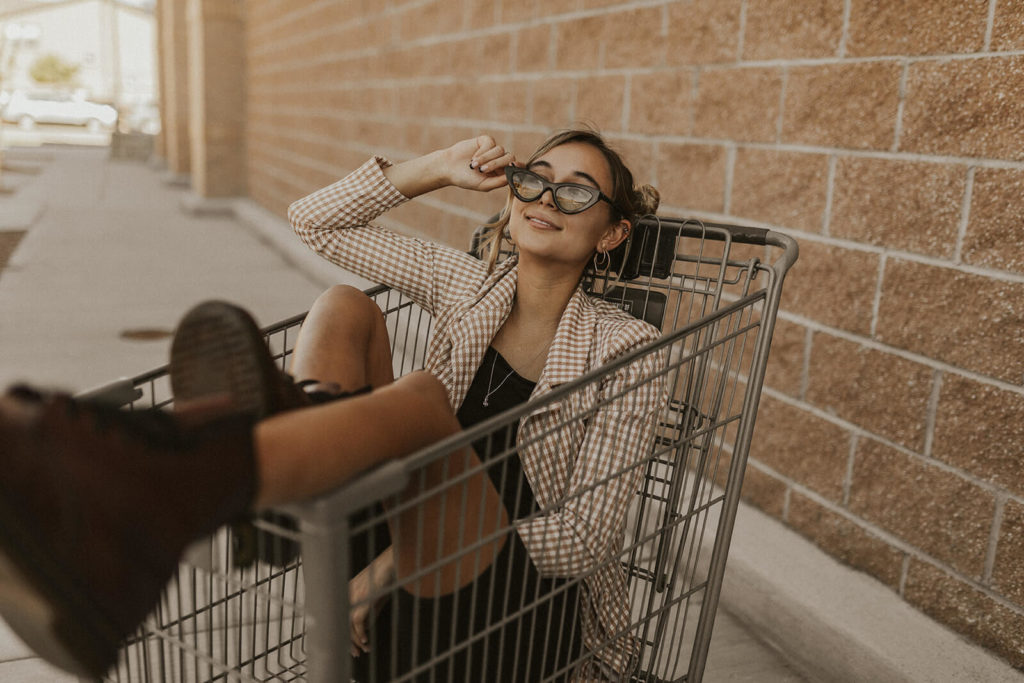
So, when Alethea told me she was planning on getting a new branding photoshoot, I jumped at the chance to help. After nailing down the creative vision of the website in general, I put together a plan for her (and her brilliant photographer!) that included a shot list, pose list, location ideas, props, and more. I think I even said something along the lines of “it would be REALLY cool if you could go to a grocery store and do some grocery shots” at the end as a random, silly idea. Alethea took that to heart, and those turned out to be some of the most iconic shots of the shoot.
Use of High-End, Restaurant-y Fonts
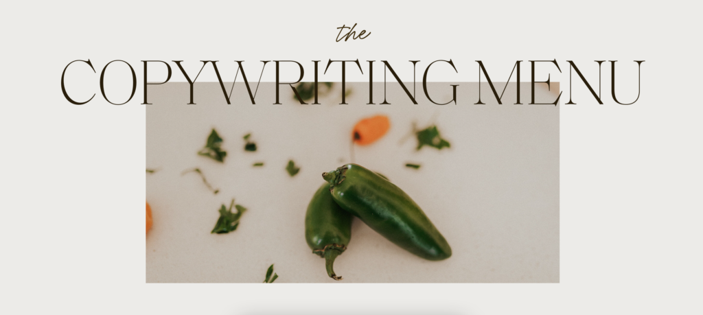
Like any great copywriter knows, copy comes before design. Since Alethea had her website copy written before we started, I was able to see that she was using a ton of food-driven language, such as “The Copywriting Menu” and “a squeeze of lemon, a pinch of salt”. It got me thinking—how might we choose fonts that feel like an upscale-casual restaurant? Ultimately, we settled on the use of a serif & a script combo.
Use of a Grounded, Boho-Like Color Pallette
To contrast a lot of the editorial style we’ve got going—the photos, the fonts, etc—I wanted to make sure that a grounded, earthy, boho element was still being felt throughout the site. So, instead of using lots of whites & blacks (very editorial!), I opted to use creams & browns. The greens, burnt oranges, and tans came naturally afterward, working in beautiful cohesion with the coloring of her photos and the spice & veggie motifs we’ve established throughout the site.
Use of Zany, Sharp Angles
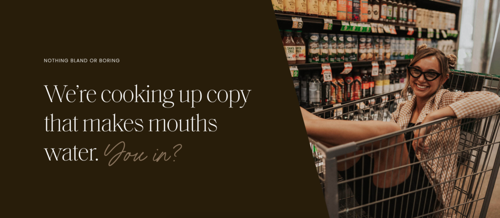
While boho & editorial are obviously great, I knew there also needed to be an element of fun, eccentricism, and quirk. (It’s called Copy with Spice, after all!) BUT I needed to accomplish this fun without cheapening or lightening the vibe too much. So, I settled on the use of unique, fun, yet sharp angles throughout the site to give it an element of “we don’t take ourselves too seriously here“. Here’s a few examples of how that manifested.
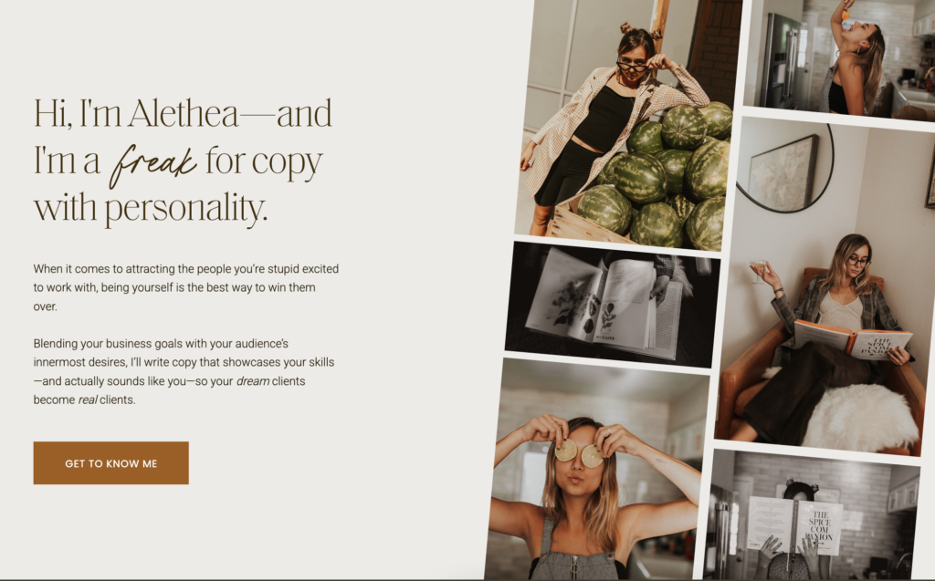
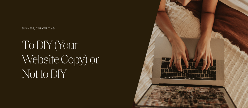
Some of My Favorite Parts
Apart from, well, all of it, here are a few of my absolute favorite sections of the new-and-improved Copy with Spice.
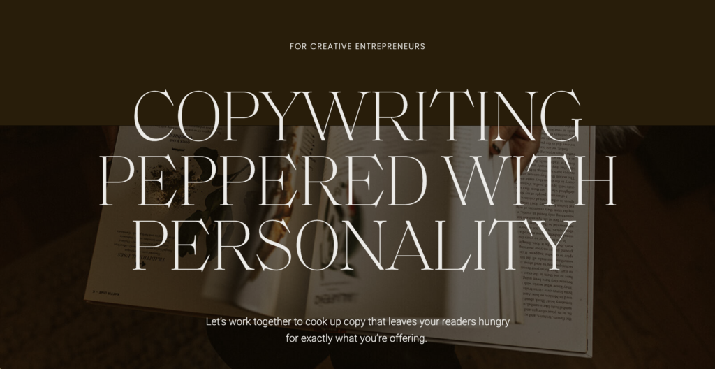
Large Headings, Small Subheadings
There’s nothing more editorial than HUGE contrast in font sizing. Plus, it just works for the bold statements that Copy with Spice is all about. Also, strategy aside— I just love how it looks.
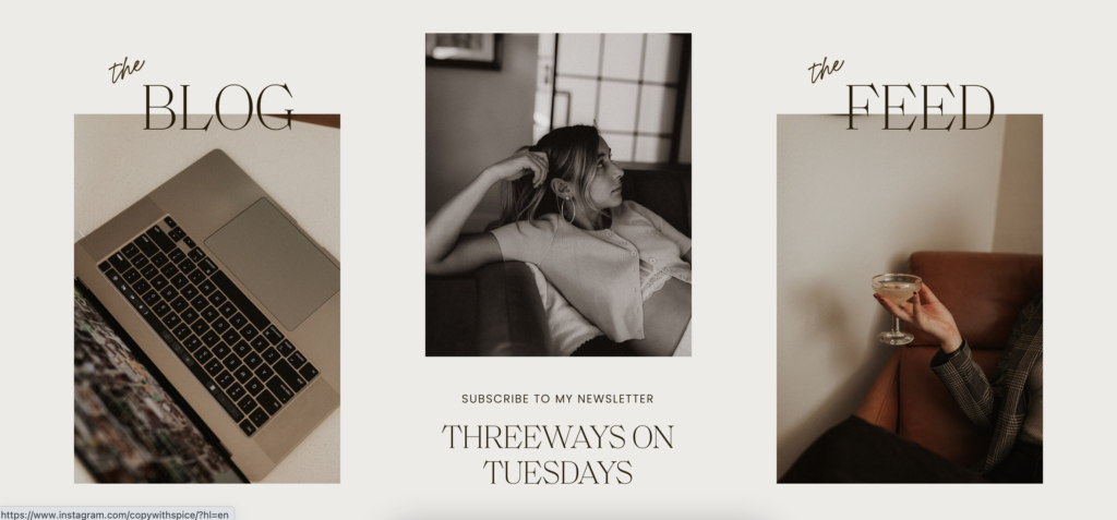
This Content Overview
Maybe it’s because her newsletter is a sexual innuendo, maybe it’s because I love a scattered image moment like this, but this section just really turned out swell in my opinion! (I am biased, though.)
The Outcome: Copy with Spice Brand & Website Launch
The success of Alethea’s launch remains to be seen, as I am posting this blog on her launch day! (I’ll be sure to keep this blog post updated with any available stats.) But apart from the statistical ROI, she’s already feeling more confident in her website than ever.
“The site is STUNNING. I’m in love. It’s hard to believe it’s mine! With every ounce of gratitude I can express, THANK YOU!”
Want this to be you? You know where to find me.
Credits & Collaborators
Photoshoot Art Direction, Branding, Website Design & Development: Kleist Creative
Photography: Gracie Wilson
Strategy: Between the Lines Copy
Hi, I'm Sarah Kleist.
Brand & web designer, personal brand strategist, and marketing educator obsessed with the power of connecting with audiences.
SUBSCRIBE TO
ACT BREAK
An actually-fun-to-read weekly newsletter about marketing, design, business, the arts, creativity, mindset and more.
love this post?
share it!
read the next one:
