FILED UNDER:
June 14, 2022
I met Sarah Price like I meet so many amazing business owners; online! What started as an off-the-cuff referral from my copywriter bestie turned into a uniquely fulfilling project that I couldn’t wait to launch and post about. So without further ado, here’s all the tea about my website project with the undeniably talented Sarah Price.
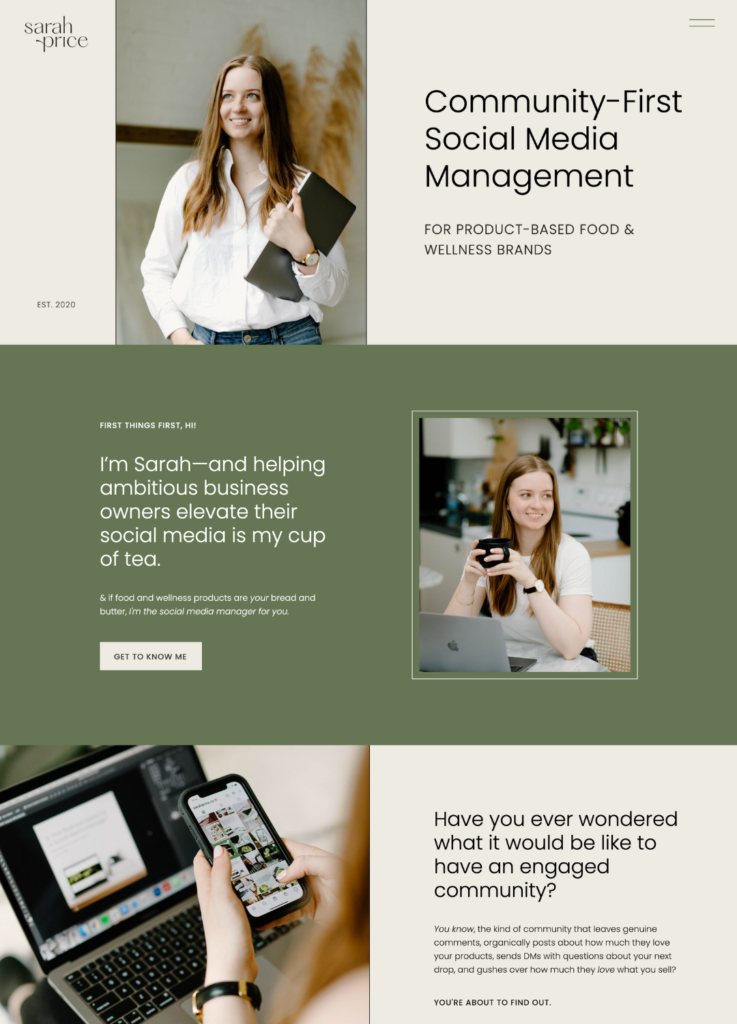
The Project
Sarah Price is a social media manager specializing in product-based food & wellness brands. What does that even mean? It means that if you’re selling anything from honey to supplements to beverages (and beyond), Sarah’s the social media manager for you.
When Sarah inquired with me for website help, her business was doing well. She already had some pretty amazing clients and results—she even helped one account grow their following to 130K+.
Buuuut, she wanted to help even more business owners in the food & wellness space, and decided that a website speaking directly to them was going to help her do that.
And after working with one of my closest friends, Between the Lines Copy, on her copy & messaging, she decided that working with me on a website was the next best step. (And I’m so glad she did, because when I caught one glimpse of her branding & photography materials I was like omg, I cannot wait to play with this stuff.)
Goals & Deliverables
In addition to improving the story, design & flow of her site (so that she can continue to sell premium packages to clients), Sarah wanted to add a few additional elements. Here’s what we added:
- A digital home for freebies, blogs, and resource content. You can see these elements incorporated on her blog & resource pages.
- A digital download shop, where Sarah can sell her own products and serve a wider audience at different price points.
- A portfolio page, where prospective clients can get all the ins-and-outs on specific projects and her strategy behind them (beyond all the amazing stats she already has).
To meet these goals, we planned a medium-size build that followed a familiar site structure for someone who is selling both products and services. Luckily, I had the copy already laid out (written by the brilliant BTL!), so formatting the structure of the site was a breeze.
Design Challenges
Any website where there’s a lot of juicy content requires a lot of thought. Luckily, Sarah’s brand is already what would be considered clean, which made my job a lot easier. The more clean the design, the easier it is to make the words the star of the show. (Which, in this case, they are!)
Design Solutions
Design tells a story and makes us feel a certain kinda way. Here are a few of the design choices I made to make the story of Sarah’s packages leap off the page.
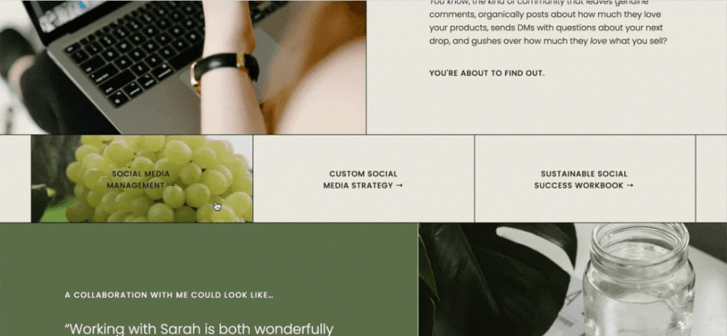
Tasteful Use of Video
As a social media manager, Sarah knows the importance of video content. While feed posts & graphics are her bread and butter, her packages also include TikTok & Reels content for the brands she works with. As such, I wanted to make sure that video remained a key part of the design, even in the most unsuspecting places. Here’s a cute hover effect I included on the homepage.
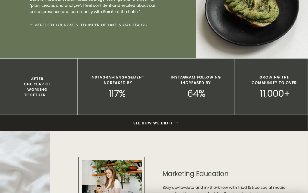
Use of Lines as Structured Sections
While many social media managers focus solely on the aesthetics, Sarah shines in both the aesthetics and strategy. (AKA, she’s not only interested in helping you make it look good. She wants your social to convert!) As such, I had toooonnnssss of fun stats to play with on the website, and so I thought the best way to make it feel as structured and strategic (as Sarah’s process is!) was to use lines as a design element. Take this section for example.
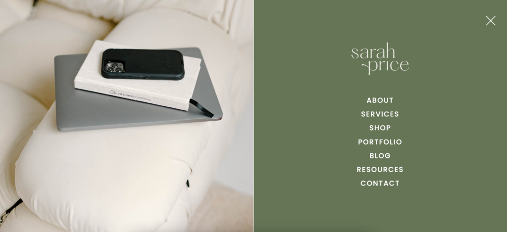
A Hamburger Navigation
I opted to use a hamburger navigation (even on desktop!) as opposed to a traditional header where the navigation menu is visible. I did this for a couple of reasons. Firstly, to stay with the clean and simple vibe — this allows the first thing you read on each page to be the header (which is what we want anyway!). And secondly, because Sarah has so many facets of her business now—services, shop, resources, blog, etc—I thought a dropdown navigation would make for a clearer menu to display everything.
Our Favorite Parts
Honestly, I wouldn’t be writing a blog post case study if I didn’t love the entire thing, but here are some of the sections that I love a little bit extra.
The Blog
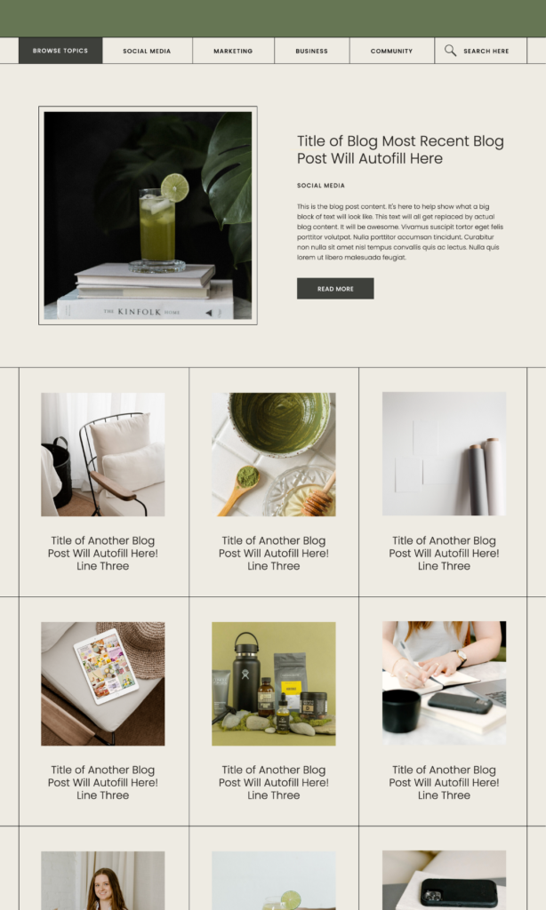
I am suuuuuuch a sucker for grid lines on a site, and I’ve always secretly wanted to do a blog style like this. Luckily, Sarah’s project was the perfect place to bring this to life.
The Services Menu
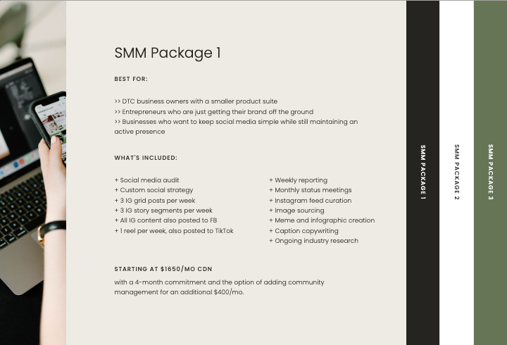
This services menu allows the user to open each package option like pages in a book. (And although this was a totally custom site, Sarah noticed this function in my Narrative template and said “wait, I want that too!”)
Wellness Social Media Manager Website Launch: The Outcome
Together, Sarah, Sara and I (also a Sarah 😉) were able to create an SEO friendly, high-converting, on-brand website to promote Sarah’s social media services, strategy packages, and products.
Check Out What the Client Had To Say
“Working with Sarah was a dream come true. She has the most streamlined client experience that allowed me to relax, have fun, get creative, and enjoy launching my new website, instead of feeling the usual dread and overwhelm and anxiety that comes with a DIY site. Not only was the experience fab but the results were beyond what I could have hoped for – she didn’t just build a website, she created a hub for all things related to my biz and community. Now I feel so excited to send prospective clients to my site, knowing they’ll love what they see.”
I’ll be sure to keep this page updated on any measurable success she sees from the launch of this site; but in the meantime, we’re pretty damn proud and excited to hit publish 😉
If you’re bringing a new idea into this world and need a home on the internet to help you do so, I would love to help you with a custom website project. Cannot wait to chat.
ADDITIONAL CREDITS & COLLABORATORS
Custom Website Design by Me
Copywriting by Between the Lines Copy
Branding by Studio Oros
Photography by Kaela Leone
Hi, I'm Sarah Kleist.
Brand & web designer, personal brand strategist, and marketing educator obsessed with the power of connecting with audiences.
SUBSCRIBE TO
ACT BREAK
An actually-fun-to-read weekly newsletter about marketing, design, business, the arts, creativity, mindset and more.
love this post?
share it!
read the next one:
