
")


FILED UNDER:
February 26, 2024
I recently took on THE most fun Website in a Day project with an amazing client (and friend) who also happens to be a triple threat: actor, makeup artist for headshots, and acting coach.
In this case study, I’ll give you the fun backstory on how we connected, the goals we set for the website, the design hurdles we had to clear, and the solutions that made it all come together. I’ll also share the parts of this project that were most rewarding for me and one incredible investment she made before our work together that made the whole thing 10x better.
But before we get into all that, let me tell you how this whole website-in-a-day thing happened…
A Little Backstory
Kat Wolff and I had never actually met in real life (until last week when we bumped into each other at a popular lunch spot near the audition studios lmfao), though we’d been connected on social media for months.
She signed up when I decided to create an online course on how to launch a creative business last year—and clearly my class resonated, because Kat soon started up her own headshot makeup artistry, then expanded into coaching and leading acting workshops.
I was TRULY thrilled to watch her new ventures unfold from afar—I was so excited that my class had helped spark real entrepreneurship.
But it got even better: months later, Kat finally approached me about collaborating on a design project. She was ready have a professional website built that could showcase all her blossoming creative businesses, and I knew with my background supporting artists, we’d be an ideal match for making that website magic happen.
Design Goals, Deliverables, and Challenges
When Kat and I sat down to define the vision for her new website, our goal list was all about catering to her diverse set of ideal clients – casting directors, fellow actors seeking headshot makeup services or acting coaching, you name it.
(I have a similar challenge with my own website. At any given moment, I could be attracting potential design clients from the wedding industry, OR Broadway casting directors–it runs the gamut.)
Hence, we needed to craft a user experience that would resonate across many audiences. But even more vital to our goal was building a visual brand identity for Kat that would pop amid competitors, while still feeling completely authentic to who she is. And with all her creative ventures, portraying true versatility was key. That meant embracing Kat’s love for vibrant colors and conveying her bubbly personality.
The Gamechanger
I’ve said it before and I’ll say it again: Great brand photography is THE most important visual element to have when designing a new website.
So when Kat told me she was having a brand photoshoot done by the ONE AND ONLY Sub/Urban Photography, I was ecstatic. (Sub/Urban has done my own headshots for years, and I am dying to do a brand shoot with them as well.)
I knew it would be great, but I didn’t know how great—until I saw it. The photos were CHEF’S. KISS. I mean, go see for yourself.
(Quick sidebar: if you’re looking to learn how to plan a brand photoshoot as epic as Kat’s, check out this absolutely epic resource that teaches you EVERYTHING I know about how.)
Design Solutions
Here’s how we achieved our goals, solved design challenges, and used those INCREDIBLE brand photos to create a site that feels perfect for Kat.

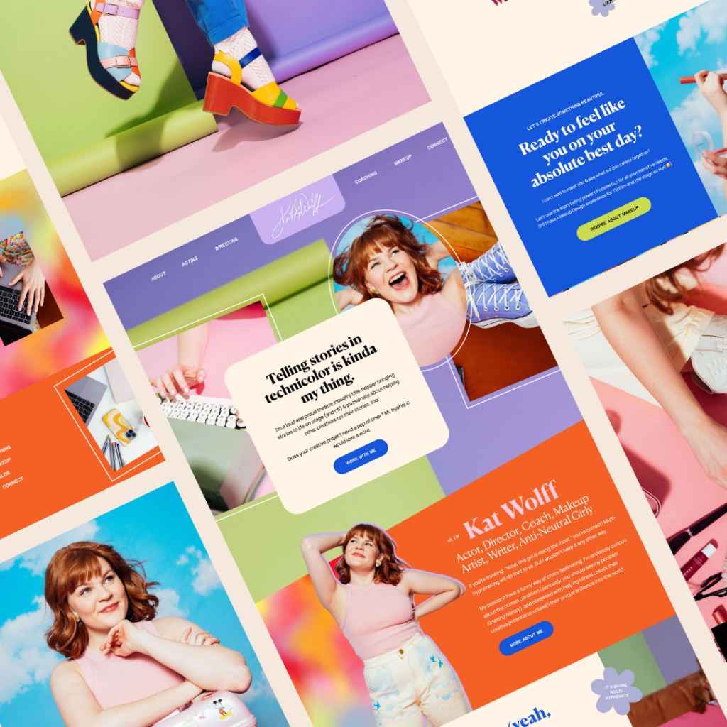
Use of a Vibrant, Bubbly Color Palette
Kat came to me with a color palette idea already established, for which I only tweaked a little bit due to contrast and readability. The bright and bubbly color palette we ended up with instantly conveys Kat’s energetic personality – it’s a joyful riot of orange, purple, pink, green, and cobalt.
With each section of the site popping in a different signature hue, visitors get a multi-hued snapshot of Kat’s colorful range…just like her! The vibrant palette and thoughtful color symbolism help reinforce her personal brand of creative vibrancy and innovation.

Use of Tye-Dye and Gradient Textures
In addition to the vibrant color palette, Kat had actually given me a super cool abstract tie-dye graphic she created to use on her socials. I was obsessed.
Beyond looking funky and eye-catching, the tie-dye patterns and color gradients symbolize how all of Kat’s passions and talents bleed into and enhance each other. The hazy colorful mixing represents the fluid interplay between her acting, coaching, and cosmetic artistry skills. The gradients also portray how she helps actors smoothly transition into new roles with her coaching.
Using gradients to blend those tie-dye textures with the bouncy color palette made for such a fun, lively site style reflecting Kat’s uniqueness. And it’s way more interesting design-wise than having all flat, basic colors! The exploded tie-dye branding feels like a perfect fit for Kat’s brand.

A Chunky Heading Font with Personality
When selecting fonts for Kat’s site, legibility and personality were equally important. She already had this really cool hand-drawn sans serif that perfectly captured her creative spirit – we ultimately used that for subheads and accents.
But for the main headings, I felt we needed something cleaner yet still playful. I chose Canela Bold: an ultra-bold, chunky display font with bounce, charm, AND sophistication. The thick, funky letterforms have a stylized roundness, fitting Kat perfectly.
So whether a casting director or fellow actor lands on Kat’s site, those friendly, bubbly blue headers in Canela Bold make a fun first impression by pairing readability with liveliness and approachability.
My Favorite Parts
The Frames
Kat does a weekly series on Instagram called the “Weekly Reframe”, so I liked the idea of using “frames” in some sort of structural way on the site. The result? Medium-thickness outlines around photographs, providing an extra layer of graphic intrigue.

Layering and Outer Shadows
Wherever possible, I tried to use layers as an interesting design focal point. Additionally, if I ever used a cutout of Kat, I always used an outer shadow with minimal opacity, to give it that “outlined” feel. I love how much of a “drawing” vibe this gave, enhancing the “creative energy” of it all.

Use of Kat’s Real Life Handwriting
Another genius idea by Kat herself—using her real-life handwriting! I advised us not to use it often because of the SEO benefits you’d lose by using images of handwriting instead of actual text on a website. But on strategic parts of the about page (or even in the logo), it’s the perfect thing.

The Perfect Blend of Personality and Professionalism
This whole entire project was so fun, I RANNNNNN to add it to my portfolio when all was said and done. Luckily, Kat agreed.
Are you next?
I’d love to give you an experience just like Kat! Check out details here, and inquire here!

Hi, I'm Sarah Kleist.
Brand & web designer, personal brand strategist, and marketing educator obsessed with the power of connecting with audiences.
SUBSCRIBE TO
ACT BREAK
An actually-fun-to-read weekly newsletter about marketing, design, business, the arts, creativity, mindset and more.
love this post?
share it!
read the next one:

")
")
")