FILED UNDER:
January 5, 2021
So, you’ve got a website. (Or, you will.) But now comes the hard part. What makes a good website homepage? Don’t worry. I gotchu.
First of all — YAS. It’s my personal belief that almost everyone could benefit from a website in one way or another. Whether you’re a personal brand, a creative, or just a human out in the world trying to have a successful career, a website is a great place to start. And it’s a place you have complete control over, unlike platforms like Linkedin, IG, Tik Tok, FB, Pinterest (or wherever else).
Here’s my official list: the 3 most crucial things to have on your website’s homepage.
1.) Photos of You
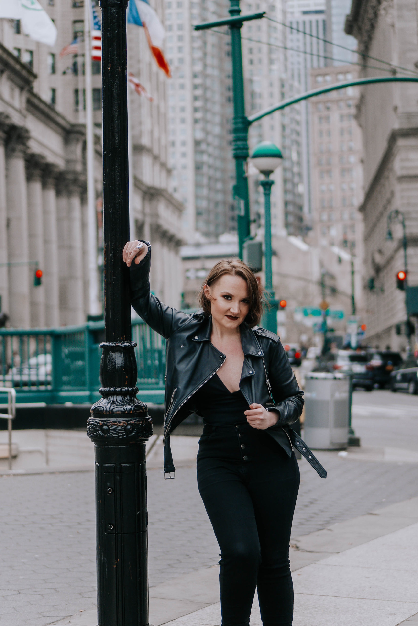
Friends, I’m telling you. If there’s ONE THING to invest in for your website (besides your designer, *wink*), it’s a lifestyle or “branding” photoshoot with a professional photographer. Get together a couple outfits that you feel like you in, and go to a couple nice locations with tons of natural light.
You could have the best website designer in the world, but if you don’t have high quality photos, your website is not going to pop.
Pro-tip: When picking outfits and locations, keep colors in mind! Oftentimes, when I’m designing a site for someone who has great pics, I pull colors and styles directly from the photos. This gives the feeling that everything was created seamlessly and with intention (which… it was!).
(Side note: wanna plan the best ever brand photoshoot? Here’s an absolutely epic resource.)
2.) Pathways to Different Pages of Your Site
Don’t make people go to seperate pages to learn about everything you do! This goes especially for you, multi-hyphenates.
Instead of relying on solely the navigation menu to spell out all the hats you wear, give us a little hint of each on the homepage (and then use the other pages to go further in depth).
When someone visits your website, you have about 10 seconds to hook them. So if someone stumbles on your homepage, think: what would you want them to learn?
Pro-tip: pick 3 things to feature on your homepage that can be found on the rest of the site. Give us a little sneak peak of what to expect on that page, and then link us there!
And along those lines…
3.) Repetition
Don’t be afraid to be repetitive.
Do you have a personal mission statement? A “main photo”? A way you normally introduce or describe yourself? Put that literally everywhere.
I’m talking: on the homepage, on the about page, in the footer, in the navigation if you can find a clean way to… like, literally, everywhere.
I used to be so scared of this; I was like, people get it! People know me and what I do, I don’t need to shove it down their throat. Except that’s not true! Sure, your family, your close friends, and even your acquaintances get it. But you have literally no idea who is visiting your site, and you’d be shocked at the difference some simple repetition can make.
If you don’t believe me, here’s an article about the marriage between website copy, repetition, and psychology.
So, what makes a good website homepage?
If you’re looking for a few sure-fire ways to retain visitors, maximize the amount of time people spend on your site, or level up your “trust” factor, these three homepage tips are a great place to start.
And if you’re like, “Sarah, I totally agree and love this, but I don’t have time to figure this all out myself!”, you can head to my template shop for pre-designed websites, or you can hire me for a custom design project. Can’t wait to hear from you!
Hi, I'm Sarah Kleist.
Brand & web designer, personal brand strategist, and marketing educator obsessed with the power of connecting with audiences.
SUBSCRIBE TO
ACT BREAK
An actually-fun-to-read weekly newsletter about marketing, design, business, the arts, creativity, mindset and more.
love this post?
share it!
read the next one:
